Visualization
EasyBench includes various visualization options to represent benchmark results in graph format.
Note
To use visualization, you need to install matplotlib:
pip install matplotlib
If you want to use the seaborn engine, also install seaborn:
pip install seaborn
Visualization Reporters
For visualization, you can specify as a string or use various formatters with PlotReporter:
| matplotlib-based | seaborn-based | Formatter | Description |
|---|---|---|---|
"boxplot" |
"boxplot-sns" |
BoxPlotFormatter |
Visualization with boxplot |
"violinplot" |
"violinplot-sns" |
ViolinPlotFormatter |
Visualization with violinplot |
"lineplot" |
"lineplot-sns" |
LinePlotFormatter |
Visualization with lineplot |
"histplot" |
"histplot-sns" |
HistPlotFormatter |
Visualization with histplot (histogram) |
"barplot" |
"barplot-sns" |
BarPlotFormatter |
Visualization with barplot |
Common Visualization Parameters
Main parameters available for all visualization formatters:
figsize: Graph size (default:(10, 6))log_scale: Whether to use logarithmic scale (default:False)engine: Plot engine ("matplotlib"(default) or"seaborn")sns_theme: Seaborn theme settings dictionary (example:{"style": "darkgrid", "palette": "Set2"})
Additionally, each formatter can accept parameters for the corresponding drawing function of the specified engine (e.g., when using the seaborn engine with BoxPlotFormatter, options like linewidth for seaborn.boxplot can also be specified).
Visualization Options
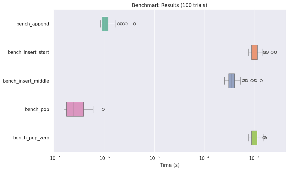
Box Plot (BoxPlotFormatter)
(API reference: BoxPlotFormatter, matplotlib, seaborn)
Visualizes benchmark results as a box plot:
from easybench import BenchConfig, EasyBench, customize
from easybench.visualization import BoxPlotFormatter, PlotReporter


class BenchList(EasyBench):
    bench_config = BenchConfig(
        trials=100,
        warmups=100,
        loops_per_trial=100,
        reporters=[
            "console",  # Include normal console output
            PlotReporter(
                BoxPlotFormatter(
                    showfliers=True,           # Show outliers
                    log_scale=True,            # Use logarithmic scale
                    engine="seaborn",          # Use seaborn as the plot engine
                    orientation="horizontal",  # Horizontal or vertical orientation
                    width=0.5,                 # Box width (seaborn only)
                    linewidth=0.5,             # Line width (seaborn only)
                ),
                show=True,                     # Display the graph on screen
                save_path="benchmark_results.png",  # Save as image file
                dpi=150,                       # Image resolution
            ),
        ],
    )

    def setup_trial(self):
        self.big_list = list(range(1_000_000))

    @customize(loops_per_trial=1000)
    def bench_append(self):
        self.big_list.append(-1)

    def bench_insert_start(self):
        self.big_list.insert(0, -1)

    def bench_insert_middle(self):
        self.big_list.insert(len(self.big_list) // 2, -1)

    @customize(loops_per_trial=1000)
    def bench_pop(self):
        self.big_list.pop()

    def bench_pop_zero(self):
        self.big_list.pop(0)


if __name__ == "__main__":
    BenchList().bench()
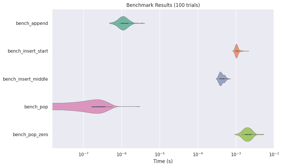
Violin Plot (ViolinPlotFormatter)
(API reference: ViolinPlotFormatter, matplotlib, seaborn)
Violin plots display the distribution of data in more detail:
from easybench import BenchConfig
from easybench.visualization import ViolinPlotFormatter, PlotReporter

# Configuration example
bench_config = BenchConfig(
    trials=100,
    reporters=[
        "console",
        PlotReporter(
            ViolinPlotFormatter(
                log_scale=True,
                inner="box",  # Internal display format (seaborn only)
                cut=2,        # Distribution cut position (seaborn only)
                engine="seaborn",
                ...
            ),
            save_path="violin_results.png",
        ),
    ],
)
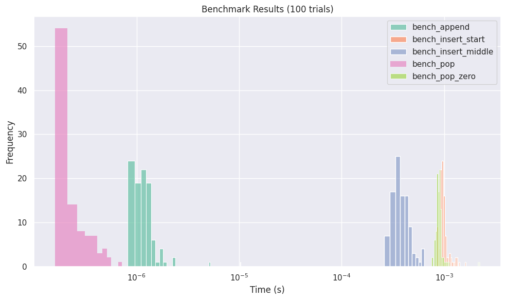
Histogram (HistPlotFormatter)
(API reference: HistPlotFormatter, matplotlib, seaborn)
Displays the distribution of benchmark results as a histogram:
from easybench import BenchConfig
from easybench.visualization import HistPlotFormatter, PlotReporter

bench_config = BenchConfig(
    trials=100,
    reporters=[
        "console",
        PlotReporter(
            HistPlotFormatter(
                bins=10,           # Number of bins
                kde=False,         # Display kernel density estimation (seaborn only)
                engine="seaborn",
                ...
            ),
            save_path="histogram_results.png",
        ),
    ],
)
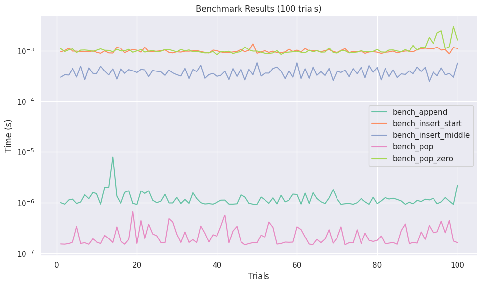
Line Plot (LinePlotFormatter)
(API reference: LinePlotFormatter, matplotlib, seaborn)
Visualizes the progression of benchmark results:
from easybench import BenchConfig
from easybench.visualization import LinePlotFormatter, PlotReporter

bench_config = BenchConfig(
    trials=100,
    reporters=[
        "console",
        PlotReporter(
            LinePlotFormatter(
                engine="seaborn",
                markers=False,  # Marker settings (seaborn only)
                dashes=False,   # Line settings (seaborn only)
                ...
            ),
            save_path="line_results.png",
        ),
    ],
)
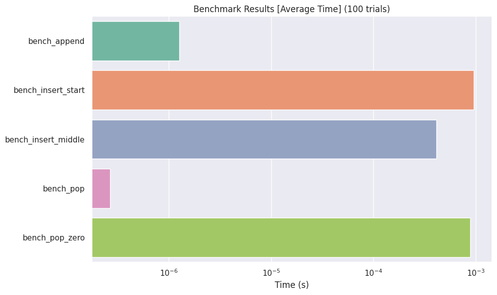
Bar Plot (BarPlotFormatter)
(API reference: BarPlotFormatter, matplotlib, seaborn)
Displays each benchmark result as a bar graph:
from easybench import BenchConfig
from easybench.visualization import BarPlotFormatter, PlotReporter

bench_config = BenchConfig(
    trials=10,
    reporters=[
        "console",
        PlotReporter(
            BarPlotFormatter(
                log_scale=True,
                metric="avg",      # Statistic to display ("avg", "min", "max")
                engine="seaborn",
                ...
            ),
            save_path="bar_results.png",
        ),
    ],
)
Customizing Visualizations
For more detailed customization, refer to the options for the PlotReporter and each *PlotFormatter class. Also, refer to Creating Custom Reporters and Formatters for information on how to create your own visualization formatter.